Table of Contents
Your blog’s homepage is basically your handshake—it’s the first thing people see. It should be clear, welcoming, and not a pain to use.
To improve user experience, your homepage should have a clear headline, simple navigation, and key content that quickly shows what your blog is about. If you nail these, visitors won’t feel lost or overwhelmed.
A clean design with enough white space helps the page breathe. Make sure your homepage answers visitors’ main questions right away.
Highlight your best content. Small, well-organized sections and visible calls-to-action guide users where you want them to go.
Key Takeways
- Your homepage should clearly show the purpose of your blog.
- Use simple design and easy navigation to keep visitors engaged.
- Highlight your best content to help users quickly find value.
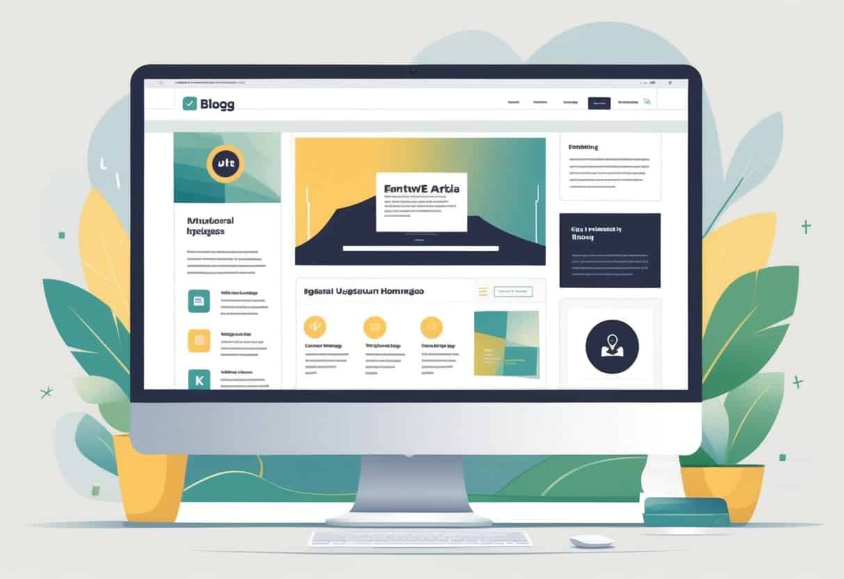
Essential Elements for an Engaging Blog Homepage
Your blog’s homepage should clearly show your content’s structure. Make it easy for visitors to find what interests them.
Use design and layout choices that guide readers. You want people to stick around, right?
Clear and Hierarchical Navigation
Good navigation is simple. Your blog’s main menu should list broad topics or sections so people aren’t guessing.
Use a clear hierarchy: main links for big topics, subcategories underneath. Labels should be short and use familiar words tied to your blog’s focus.
Add a search bar so visitors can quickly find specific posts. Keep navigation consistent everywhere—no one likes surprises when clicking around.
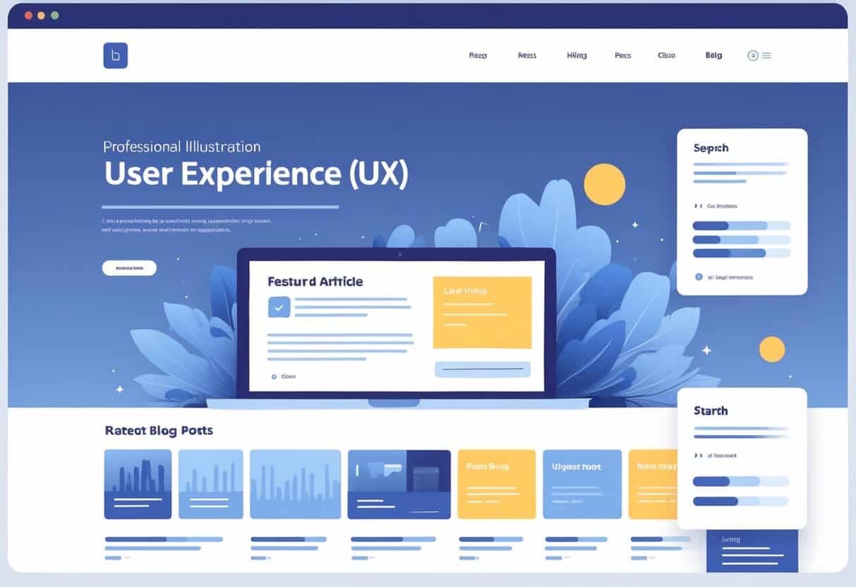
Compelling Hero Section
The hero section is what people see first. It should grab attention, but don’t overdo it.
Use a strong headline that tells visitors what your blog is about in a sentence. Add a brief description or tagline to explain your blog’s value.
A featured image or simple graphic that matches your blog’s vibe can help. A clear call-to-action—like “Browse Latest Posts” or “Explore Categories”—nudges visitors to check out more.
Featured Blog Categories
Highlight your main blog categories to help visitors jump to topics they care about. Use blocks or cards with category names and short descriptions.
Adding images or icons to categories makes scanning easier. Display your top categories near the homepage center or just below the hero section.
Limit the number of categories to keep things tidy and easy to navigate.
Optimizing Blog Homepage Content for User Experience
Your homepage sets the stage for how visitors interact with your content. Organizing key elements clearly helps people find what matters to them—fast.
Using smart content choices and navigation aids makes a difference in how people feel about your site.
Recent and Popular Posts Display
Showing your most recent and popular posts lets visitors see what’s new and what others like. You can put these in separate lists or combine them.
Use clear headings like “Latest Posts” and “Popular Reads” to guide users. Include post titles with short summaries or images to catch the eye.
Update recent posts automatically so the content stays fresh. Popular posts should be based on real engagement, like views or comments, so they’re actually relevant.
Effective Use of Tags
Tags organize your content by topics or themes. Use simple, descriptive tags that make sense for each post.
Don’t go overboard with tags or things get messy. Display tags visibly on the homepage or near post summaries.
You can create tag clouds or lists sorted by popularity or topic. Tags help users find related posts without extra searching.
They also remind you to stay focused on your main topics when writing.
Incorporating Testimonials
Adding testimonials to your homepage builds trust with new visitors. Pick short, specific quotes from readers or clients that show your blog’s value.
Format testimonials clearly—bold text or quotation marks work well. If you can, include the person’s name and role for authenticity.
Place testimonials near your main content areas, but don’t let them crowd the page. Real feedback encourages visitors to stick around and maybe even share their own thoughts.
Design Principles and SEO Best Practices
Your homepage should balance clear design with good SEO. Readable fonts, consistent user interface elements, and structured content help visitors find and absorb info.
This approach also helps search engines understand and rank your site.
Strategic Use of Typography
Pick fonts that are easy to read on both desktop and mobile. Body text should be at least 16 pixels—no one wants to squint.
Stick to two or three font families for a clean, professional look. Headings should stand out and use consistent sizes.
Use bold or italics sparingly to highlight important points. Good line spacing and strong contrast between text and background make everything easier to read.
UI Design Consistency
Keep buttons, colors, and navigation menus consistent throughout your homepage. This helps people learn how to get around your site quickly.
Put key features like the search bar, main menu, and categories where users expect them. Clear calls to action should point visitors toward your best content.
Use whitespace to avoid clutter. A balanced layout makes it easier for visitors to explore and enjoy your blog.
SEO-Friendly Structure
Organize your homepage with clear headings—think H1, H2, and so on. This lets search engines quickly spot your main topics.
Naturally work relevant keywords into your titles, headings, and short blurbs. Forget about keyword stuffing; it’s more about actually helping people find what they need.
Add descriptive alt text to your images. Make sure every link uses anchor text that actually means something—no more “click here” nonsense.
A tidy, well-structured homepage isn’t just for search engines. It makes things easier for your visitors, too.